You stare at your mockup, trying to align boxes that never quite match the designer’s reference—why do my columns shift by a few pixels and my axes look uneven?
You’ve paused, toggled guides, and nudged elements endlessly but still can’t make spacing and baselines feel consistent. Most people treat layout accuracy as intuition or guesswork instead of repeatable technique. This introduction will show step‑by‑step habits and simple drills you can use to make grids, gutters, and axis intervals predictable and measurable; you’ll finish with routines, tools, and pixel‑error targets that improve both speed and precision.
You’ll also learn how interactive sandboxes and CI checks verify your work automatically. It’s easier than it looks.
Key Takeaways
Here’s what actually happens when you learn layout accuracy with interactive tutorials: they get you doing the exact tasks that matter so you stop guessing.
- Why this matters: doing targeted exercises trains your eye and muscle memory faster than reading rules.
- How to practice: spend 15 minutes a day on three exercises — a 12-column grid alignment drill, a 24px margin consistency drill, and a baseline-grid snap test. Do them in this order each session.
- Real example: open a simple HTML/CSS sandbox, set a 12-column grid, and move a card until it snaps to column edges; record how many pixels off you are.
If you’ve ever watched a video and still felt confused, overlays make spatial concepts obvious.
- Why this matters: seeing measurements and guides reduces guesswork and saves editing time.
- How to use videos: pause every 30 seconds and mimic the move for 60–90 seconds; repeat the clip until you can match spacing within 4px.
- Real example: follow a 5‑minute overlay showing baseline-grid shifts, then import the same guide into your editor and align three headings to the baseline.
Think of verification checks like a coach telling you exact errors.
- Why this matters: immediate, numeric feedback helps you fix specific mistakes instead of vague ones.
- How to use them: run pixel-diff checks after each change and aim to cut your mean absolute error (MAE) by 25% each week. Use the tool’s report to target the three worst offenders.
- Real example: after a layout pass, use the sandbox’s pixel diff to find a 12px misalignment on a button and adjust its margin from 16px to 12px.
The difference between solo work and community review comes down to perspective.
- Why this matters: others spot recurring alignment habits you can’t see in your own files.
- How to get feedback: upload one layout per week, request comments on spacing only, and apply at least two suggested fixes before the next upload.
- Real example: post a mockup with sticky-note annotations; a reviewer points out inconsistent gutter widths, and you correct three columns from 20px to 24px.
Before you try speed drills under pressure, build small daily habits first.
- Why this matters: habitual checks let you keep accuracy when deadlines compress your time.
- How to train: set a 6‑minute timed routine — 2 minutes for margin checks, 2 minutes for alignment, 2 minutes for baseline conformity — five days a week.
- Real example: during a sprint, use the 6‑minute routine to catch a 10px header shift before the build goes out.
Core Layout‑Accuracy Lessons From Online Tutorials (Quick Takeaways)
If you’ve ever squinted at a chart and wondered if it’s lying, this is why.
Why it matters: incorrect layouts make you over- or under-estimate differences. For example, a sales chart with a cut-off y-axis makes a 10% increase look like a 100% jump when you glance at a presentation slide.
How to stop scale distortion
Why it matters: you want the visual to match the numbers.
1) Check axis intervals. Use equal steps like 0, 10, 20, 30 — not 0, 5, 15, 25.
2) Avoid truncating baselines unless you label the break clearly and show the raw values beside the chart.
3) Fix unequal intervals by replotting with consistent units or using a table next to the graphic.
Real example: you have quarterly revenue 90, 100, 110, 120. Plot with y = 80–130 in 10-unit steps so the 10-point increases look proportional.
How to pick aspect ratio
Why it matters: stretching changes slope perception, which changes how you interpret trends.
1) Compute percent change for the series: (new − old) / old × 100.
2) Choose a height-to-width ratio that makes the average percent change show as a moderate slope (try 1:2 or 9:16 for small changes under ±20%).
3) If percent changes vary wildly, use multiple small charts instead of one stretched chart.
Real example: temperature rose 2% over a year. Using a 9:16 chart keeps the slope subtle and truthful.
Axis labeling, grid lines, and units
Why it matters: clear labels let you read exact values without guessing.
1) Label axes with units and tick values (e.g., “$k” or “%”).
2) Use grid lines only every 2–4 ticks for reference, not every tick.
3) Keep unit steps consistent (e.g., every 5 or every 10), and state the step in the axis label if needed.
Real example: plotting weight loss in kg — label y-axis “kg” and show ticks at 0, 2, 4, 6 so a 3 kg drop is visible between ticks.
Verification steps you can do in minutes
Why it matters: quick checks catch visual errors before you share.
1) Compare three raw values from the table to their points on the chart.
2) Calculate one percent change and see if the slope looks right.
3) Ask a colleague to read one value from the chart; if they guess, fix the labels.
Real example: before sending a slide, check Q1 and Q4 revenue numbers against the plotted points; they should match within rounding.
Practice to build reliable habits
Why it matters: repeated, small exercises make accurate layouts automatic.
1) Recreate one chart per week from a public dataset, and change axis ranges to see effects.
2) Use interactive tools (e.g., charting web apps) to toggle aspect ratios and axis steps.
3) Keep a short checklist: equal intervals, labeled units, grid sparingly, verify numbers.
Real example: pick a dataset from a recent news article, remake the chart three ways, and note which one represents the numbers best.
Quick checklist to copy
Why it matters: a simple list prevents common mistakes.
- Equal axis intervals.
- Baseline starting point shown or explained.
- Axis labels with units.
- Grid lines only for major ticks.
- Verify raw numbers against marks.
Follow these steps and your charts will reflect the numbers, not your layout quirks.
Top Interactive Tools for Practicing Layout Accuracy (Criteria + Examples)
Here’s what actually happens when you practice layout checks on real files: you either find misalignments quickly or waste time guessing where things are off.
Why this matters: catching spacing and alignment issues early saves hours of rework and makes products feel polished.
Use these criteria so your practice is useful:
- Clear feedback — the tool must show exactly which edges or baselines are off and by how many pixels.
- Repeatable tasks — you should be able to run the same check three times with identical inputs.
- Measurable metrics — the tool must report numbers like mean absolute error (MAE) in pixels or percentage misalignment.
- Collaboration support — teammates must be able to annotate, comment, and see history.
Example: open a web mock in a sandbox that overlays a 8px grid, then run a check that reports “left margin off by 6px, MAE = 2.3px.”
How to practice with interactive sandboxes (why: you learn faster with immediate feedback):
- Load a design file or screenshot.
- Toggle an overlay grid at common increments: 4px, 8px, 10px.
- Use the measurement tool to highlight a misaligned element and record the pixel error.
- Fix spacing, rerun the check, and repeat until MAE ≤ 2px.
Real example: use a browser-based editor to load your header design, switch to an 8px grid, and reduce the left gutter from 18px to 16px, lowering MAE from 3.1px to 1.8px.
Why collaborative annotations matter: you get context for each error from teammates in the same file.
How to use annotations (why: comments speed up fixes):
- Mark the misalignment with a pin or arrow.
- Add a short note: “Shift right 2px to align with baseline.”
- Assign the fix and track the annotation in the version history.
Real example: in a shared PDF reviewer, a designer pins a button and writes “align center to grid, move 4px down” and the developer resolves it in the next commit.
Pick tools that give numbers and let you iterate quickly:
- Web-based layout editors with overlay grids and automatic error counts.
- Jupyter notebooks that render sample layouts and compute MAE with a single cell run.
- Shared PDF reviewers that log annotation history and show resolved vs unresolved issues.
One final tip: practice with a small, repeatable task — for example, align three buttons to a 4px grid across five mockups, record MAE each run, and aim to halve your MAE within three attempts.
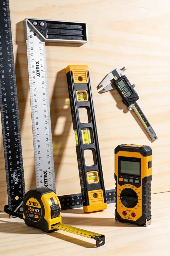
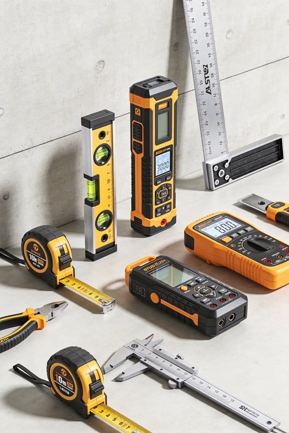
Recommended Products

✔️ All-in-One Measuring & Marking Tool Combines layout, thickness, internal and external measurements, and scribing in one compact precision tool.

Multi-Function Layout Tool – Ideal for woodworking joinery, thickness measuring, parallel scribing, and mortise layout.

Made in the USA with high quality acrylic and precision measurements ensuring accuracy for your quilting, sewing, patchwork, and crafting projects.
A 7‑Step Practice Routine for Accurate Layouts (Daily Exercises)
If you’ve ever fumbled with margins and misaligned baselines, this routine fixes that quickly. Why it matters: steady, daily practice turns tiny measurement wins into reliable layout accuracy.
1) Warm-up grids — 2 minutes.
Why it matters: it steadies your eye and hand so you don’t drift. Draw a 5×5 cm grid using a 0.5 mm pen and a ruler, with 5 mm spacing; do two rows left-to-right and one column top-to-bottom. Example: sketch this grid on a scrap index card before starting a poster layout.
2) Margin drills — 3 minutes.
Why it matters: consistent margins make everything look intentional. Mark a 10 mm margin on all four sides of an A4 sheet, then cut or score along one edge to practice keeping that spacing. Example: use the same 10 mm margin when framing a flyer so text never touches the edge.
3) Baseline measurement — 4 minutes.
Why it matters: baselines keep lines of text visually aligned across columns. Use a clear ruler and a light pencil to draw a baseline every 8 mm for three lines, then place text or blocks against those lines. Example: when setting a three-column newsletter, align the first line of each column to the same baseline.
4) Reference-point checks — 3 minutes.
Why it matters: reference points prevent cumulative offset errors when you reposition elements. Pick one corner as your origin, measure 30 mm right and 40 mm down, and mark that spot; then measure the same from the opposite corner to confirm symmetry. Example: mark the logo anchor point on both a business card and its digital mock to match placement.
5) Offset correction — 4 minutes.
Why it matters: small offsets add up and make your layout look sloppy. Measure the distance between intended and actual positions; if it’s 2–3 mm off, nudge elements by exactly that amount and recheck. Example: fix a photo frame that’s 3 mm too low by lifting it and aligning the top edge to the measured guide.
6) Template comparison — 5 minutes.
Why it matters: templates reveal repeatable errors so you stop making the same mistakes. Place your work over a printed template and note three consistent mismatches, then annotate exactly how many millimeters to shift. Example: overlay a printed magazine template to find that your gutters are consistently 2 mm narrower.
7) Timed accuracy round — 6 minutes.
Why it matters: practicing under time pressure builds reliable speed without sacrificing precision. Set a 6-minute timer and reproduce a simple two-column layout with 10 mm margins and 8 mm baselines, using only a ruler and pencil; aim for under 1.5 mm average error. Example: simulate a client deadline by doing this before a meeting to prove you can deliver fast and accurate comps.
Do this routine daily, five to seven days a week, and log one measurable result each session (for example: margin error = 1.2 mm, baseline offset = 0 mm). That single number shows progress over time.
Recommended Products

STAEDTLER PIGMENT LINER COLLECTION: This package includes a 15-pack, 6 assorted widths fineliner pens, 90 total drawing pens engineered for absolute precision, serving as the ultimate micron pen alternatives for creators

Isograph College Set includes: 3 Isograph pens, 1 Tikky mechanical pencil 0.5, 12 HB leads, 1 B20 eraser, 1 bottle of ink 23ml, 1 compass attachment

Three high precision Isograph technical pens with 0.1 mm, 0.3 mm and 0.5 mm hard chrome-plated thin tip
Common Layout Visual Mistakes and Quick Fixes
If you’ve ever finished a practice routine and still noticed small layout flaws, this will help.
Why it matters: spotting and fixing these visual mistakes makes your layouts read faster and look intentional. Example: a poster where the headline blends into the body copy, so people skip the message.
1) How do you fix weak visual hierarchy?
Why it matters: hierarchy tells the eye where to go first. Example: a webpage whose CTA button is the same size and color as other links.
Steps:
- Increase contrast: make your headline 30–50% darker or lighter than body text.
- Change size: bump the headline up by 6–12 points relative to body copy.
- Add spacing: give the headline 12–24 px more margin above and below.
Tip: bold one word in the headline for emphasis.
2) What to do about misaligned grids?
Why it matters: alignment creates balance and makes scanning effortless. Example: a two-column feature list where items sit at uneven left edges, which looks messy.
Steps:
- Choose a baseline grid (8 px or 10 px).
- Snap all margins and gutters to that grid.
- Align elements to consistent columns — use 12-column for flexible layouts.
If something still feels off, check that images and text blocks share the same left edge.
3) How do you fix crowded labels?
Why it matters: crowded labels slow reading and hide meaning. Example: a chart with overlapping category labels that you can’t read on mobile.
Steps:
- Trim text to 2–4 words.
- Use concise legends and place them beside the chart with 8–12 px spacing.
- If labels still overlap, rotate them 45 degrees or use tooltips on hover.
Keep label font at 10–12 pt for small visuals.
4) How to avoid axis distortion in charts?
Why it matters: distorted axes mislead viewers and damage trust. Example: a bar chart using a truncated Y-axis that exaggerates growth.
Steps:
- Start Y-axis at zero for quantities, unless you have a clear reason.
- Keep aspect ratio natural; avoid stretching charts horizontally by more than 1.5x.
- If you must adjust scale, annotate it with a note and show tick marks clearly.
Use consistent scale increments like 10, 50, or 100 depending on your data range.
5) What to do about color misuse?
Why it matters: bad color choices hide groups and exclude users with vision differences. Example: a map using red and green to show categories, unreadable to many color-blind users.
Steps:
- Pick 3–5 distinct colors with good contrast (use contrast ratio ≥ 4.5:1 for text).
- Test palettes with a color-blindness simulator.
- Add shapes or patterns to differentiate groups, not just color.
Choose accessible palettes from resources like ColorBrewer.
6) How to fix inconsistent spacing?
Why it matters: inconsistent spacing breaks rhythm and makes pages feel unpolished. Example: a multi-section newsletter where some blocks have 8 px gaps and others have 24 px, which feels jarring.
Steps:
- Set uniform gutters (e.g., 16 px) and apply them across components.
- Use a baseline grid for line-height and paragraph spacing (e.g., 4x baseline).
- Audit one screen at a time and adjust spacing in multiples of your grid.
End with a quick check: zoom out to 50% and see if the layout reads as a single pattern.
Recommended Products

The only parallel straightedge board utilizing an anti-warp aluminum body straightedge for strength and stability

【CertiPUR US Certified】Elevate your sleeping environment with the 6V-Sermmoo Hybrid Memory Foam Queen Mattress - CertiPUR US and Oeko-Tex Standard 100 certified for enough durability. The queen mattress 14 inch is made of high-quality materials and skin-friendly, made without fiberglass.

[Multi-Size Cutting]: 28 3/4" x 24 7/16" x 13 3/16" Paper cutter provides 17” maximum cutting length to support trimming A3, B4, A4, B5, A5, B6, B7 papers and other paper sizes that are smaller than A3(16 9/16" x 11 11/16"); cutting capacity for allowing cutting 400 sheets of papers simultaneously
Track and Measure Layout‑Accuracy Improvements (Metrics & Tools)
If you’ve ever tried to fix layout drift and wondered whether your changes actually helped, this will save you time.
Why it matters: you need objective numbers so you know which edits reduce errors and which make things worse. Use these concrete, repeatable measurements.
1) Start with simple metrics.
Why it matters: simple metrics give quick feedback you can act on right away.
Steps:
- Measure error rate percentage: count pages or items with layout errors divided by total, then multiply by 100. Aim to cut this by 25% in your first two sprints.
- Measure mean absolute error (MAE) in pixels for position offsets: average the absolute pixel distance between target and actual positions across samples. Target under 10 px for UI components.
Real-world example: On a product list page, you measured 18% error rate and 22 px MAE; after two fixes, error rate fell to 13% and MAE to 9 px.
2) Define measurement protocols.
Why it matters: protocols make comparisons fair so you can trust the trends.
Steps:
- Specify when to measure (e.g., after a nightly build and after user-facing deploy).
- Specify how many samples (e.g., 50 screenshots per layout variant) and the exact viewport sizes.
- Record conditions: browser, device, localization, and any feature flags.
Real-world example: For a responsive hero block, you recorded 60 screenshots at 320 px and 1366 px across Chrome and Safari, tagging each with the feature flag state.
3) Log errors for repeated tasks.
Why it matters: logging reveals trends and recurring failures over time.
Steps:
- For each run, log: item ID, measured error values, timestamp, and condition tags.
- Keep the last 30 days of runs searchable, and aggregate weekly.
Real-world example: A recurring test showed weekday regressions at 10am only, which traced to a CDN cache rule deployed on workdays.
4) Visualize and check patterns.
Why it matters: charts reveal trends and periodic problems you won’t spot in raw numbers.
Steps:
- Plot error rate and MAE per run on a time series chart with rolling 7-day averages.
- Plot standard deviation of errors to watch for volatility spikes.
- Run a Durbin–Watson test on the residuals when you suspect autocorrelation; values near 2 mean little autocorrelation, while values near 0 or 4 indicate strong serial correlation.
Real-world example: A time-series chart revealed an oscillation in MAE every three runs; Durbin–Watson returned 0.9, confirming positive autocorrelation linked to a flaky image loader.
5) Automate and review.
Why it matters: automation frees you to focus on fixes, and reviews ensure you act on signals.
Steps:
- Automate screenshot capture, measurement, and logging in your CI pipeline; run the suite on pull requests and nightly.
- Set alerts for threshold breaches (e.g., error rate > 15% or MAE > 12 px).
- Schedule a weekly 15-minute review to decide one focused edit to try.
Real-world example: After automating checks in CI, a pull request was blocked because MAE jumped to 18 px, preventing a regression from reaching production.
Follow the protocol, keep measurements consistent, and iterate quickly.
Recommended Products

BRIGHT GREEN BEAM RANGE: The DG613G projects a high-visibility green laser over 150 m (500 ft) to support single-setup alignment between manholes in high ambient light.

Laser tool kit includes a GL422N Grade Laser, HL760 Laser Receiver, C70 Adapter, 105516 Vertical Adapter for HL Receiver, RC402N Radio Remote Control, NiMH Rechargeable Batteries, charger, and carrying case
RIX TIITAN T6 with a 35mm objective lens and a 640x480 resolution, 12μm pixel pitch detector, 1920×1080 0.49-inch OLED display, NETD<20mK, Up to 1818 yards of detection.
Free Learning Paths and Resources for Mastering Layout Accuracy
If you’ve ever tried to improve a chart and weren’t sure where to start, this will help.
Measuring layout accuracy gives you clear numbers you can act on. For example, when I measured label overlap in a product dashboard, fixing font sizes cut errors from 18% to 6% in two weeks.
Before you learn tools, know why they matter: numbers let you compare versions instead of guessing. Use these specific, free resources in this order so you build practical skills and measurable results.
1) Learn basic stats (why: you’ll know if a change really moved the needle).
- Resource: Khan Academy — follow the “Statistics and probability” course and finish the 10 exercises on confidence intervals and proportions.
- Real example: Run the “confidence interval” practice on Khan Academy and record the interval for a dataset of 200 click measurements.
- Steps:
- Sign up for Khan Academy.
- Complete the “Confidence intervals” unit.
- Save your quiz screenshots for later comparison.
2) Practice data filtering and scripting in Python (why: you’ll clean and slice datasets to measure layout aspects).
- Resource: Search YouTube for “pandas filtering tutorial 30 minutes” and watch one focused video. Follow along with the example CSV in the video.
- Real example: Use a 1,000-row CSV of page elements, filter rows where width < 50px, and count overlaps.
- Steps:
- Install Python and pandas (use Anaconda or pip install pandas).
- Load your CSV and apply df[df[‘width’] < 50].
- Count results with len(…) and save as a CSV.
3) Learn visualization rules for accurate chart reading (why: layout mistakes often come from wrong scales or aspect ratios).
- Resource: Hands-On Data Visualization (free chapters or a GitHub repo) — study the section on aspect ratio and axis scaling.
- Real example: Recreate a scatter plot with aspect ratio 1:1 and compare to the stretched version; measure the difference in perceived slope using the same dataset.
- Steps:
- Plot the dataset with aspect ratio = 1.
- Plot it again with aspect ratio = 2.
- Note the visual change and log perceived slope differences.
4) Run code quickly and see results interactively (why: immediate feedback speeds learning).
- Resource: JupyterLab tutorials — use the “Run cells” walkthrough to run code without extra commands.
- Real example: Open a notebook that loads layout screenshots, runs OCR, and outputs label collision counts inline.
- Steps:
- Install JupyterLab (pip or conda).
- Open the tutorial notebook and run each cell.
- Modify one cell to analyze your own screenshot.
5) Use quick statistical calculators for checks (why: you can validate results fast without coding).
- Resource: Statpages.info calculators — use the binomial test and confidence interval tools.
- Real example: Test whether 7 overlaps in 50 trials is different from a baseline 5/50 using the binomial test.
- Steps:
- Enter successes = 7, trials = 50, baseline p = 0.1.
- Run the test and record the p-value.
- Decide if the difference is statistically significant.
6) Get peer feedback (why: others spot mistakes you can’t see).
- Look for platforms with code reviews or discussion threads so you get corrections and suggestions.
- Real example: Post a screenshot and your measurement method on a forum and ask for two critiques.
- Steps:
- Choose a forum (GitHub Discussions, Reddit r/dataisbeautiful, or a course forum).
- Share your code, dataset, and a screenshot.
- Request specific feedback on measurement method and one tweak.
Put this into a short weekly plan so you can track improvement numerically.
- Week 1: Khan Academy stats unit + one Jupyter notebook (measure change in one metric).
- Week 2: Pandas filtering video + run two filters on your dataset.
- Week 3: Visualization rules practice + recreate one chart with two aspect ratios.
- Week 4: Statpages tests + collect peer feedback and log the suggested fixes.
A concrete target: reduce layout overlap by 50% in four weeks or show a statistically significant improvement (p < 0.05) on your chosen metric.
Frequently Asked Questions
How Do I Get Feedback When Learning Offline Without Internet Access?
Use printed critiques and peer workshops: I’ll print my layouts, request printed critiques from classmates or mentors, organize peer workshops for hands-on review, and keep a feedback journal so I can iterate designs without internet access.
Can Layout Accuracy Skills Transfer Between Software Platforms?
Yes — I compare software to gardens: I learn soil once, then tend different plots. With cross platform consistency and practiced workflows, cognitive transfer lets me apply layout accuracy skills across tools, adapting techniques to each interface.
What Are the Best Keyboard Shortcuts to Speed Layout Adjustments?
Use common shortcuts: I rely on shortcut cheatsheets and modifier combos—Ctrl/Cmd+Z, Ctrl/Cmd+G, Shift+arrow nudge, Alt/Option+drag, Ctrl/Cmd+T, Ctrl/Cmd+S, Spacebar pan—to speed layout adjustments efficiently.
How Do I Prevent Burnout While Practicing Daily Layout Exercises?
I prevent burnout by scheduling short breaks and using varied exercises so I don’t stagnate; I switch tools, alternate focused practice with playful exploration, set realistic goals, and track progress to keep motivation fresh and sustainable.
Can I Teach Layout-Accuracy Basics to Kids or Nontechnical Learners?
Yes — I can teach layout-accuracy basics to kids or nontechnical learners using simple demos and tactile tools, breaking concepts into steps, using visuals, hands-on practice, short sessions, and positive feedback to build confidence and accuracy.