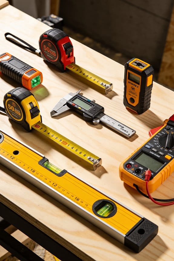
You set up a shelf and the curtain rod looks wrong — is it six inches from the edge or four? You squint, tape out gaps, and still can’t match the exact spacing from that viral clip. Most people chase vague “eye balance” tips or copy looks without measuring, so installations wobble or require rework.
This piece shows you step-by-step measurements and quick checks used in social posts, so you can replicate camera-ready layouts in your own room and hand installers clear numbers to follow. You’ll get exact distances, simple templates, and a quick verification routine. It’s easier than it seems.
Key Takeaways
Here’s what actually happens when short videos go viral and you try to copy a room.
Why it matters: you end up needing exact measurements to recreate what you see. A quick example: a 30-second reel shows a lamp on a side table; the creator lists “lamp 18 in” and the photo shows it sitting 6 in behind the table edge — the visual cue makes you measure before buying.
– Short viral videos accelerate repeatable layout experiments, making measurement-focused tweaks like 2–4 in clearances or 6–12 in drops easy to copy. Try this: pause a video, measure the item in the frame with a tape measure against a known object (a 12 in ruler or a 13 in laptop), then note the repeated distance you want — typically 2–6 inches for clearance or 6–12 inches for textile drops. Do that and you’ll avoid constant returns.
If you’ve ever tried to copy a close-up shot, this is why tiny details matter.

Why it matters: close framing makes small proportions feel huge and can trick you into buying the wrong scale. Example: a creator crops in on a skirt drop and a pendant light; the skirt looks 8 in but is actually 14 in when seen with the whole table.
– Framing and tight closeups shift attention to small, repeatable details like skirt drops and lamp scale, increasing demand for precise measurements. Measure the skirt drop from tabletop to hem (in inches) and the pendant from ceiling to bulb center (in inches), and write both numbers on your shopping list.
Think of adaptable zones like modular furniture.
Why it matters: when creators show swaps in 30 seconds, you’ll want furniture that moves. Picture a living room where a 48 in divider becomes a 36 in temporary screen to make a workspace.
– Creators demonstrate quick swaps and flexible dividers, prompting homeowners to plan adaptable zones and flexible textile measurements. Steps: 1) measure the longest and shortest configuration in inches; 2) choose textiles with at least 6 in extra seam allowance; 3) buy hardware rated for the heavier, longer setup.
Before you post your room, you need to document it.
Why it matters: buyers and installers expect photo evidence with scale. A real example: someone shared three photos with a coffee table and a paperback book for scale; the installer matched the 18 in width to the order.
– Social posts normalize documenting setups (photos, distances, reference items), raising expectations for measured delivery and installation checks. Do this: take one full-room photo, one detail photo with a reference item (a 12 in ruler or a paperback), and write the measured distances on the image or in the caption.
The difference between inspiration and install success comes down to verification.
Why it matters: copied dimensions often fail unless you test them first. Example: a copied shelf height of 14 in failed to fit the pictured plant; after logging test fits, the homeowner adjusted to 16 in and it worked.
– Virality drives checklist-style verification: copied dimensions are tested, logged, and adjusted, turning inspiration into measurable practice. Use this checklist: 1) list copied dimensions in inches; 2) test fit with tape/temporary mockup; 3) log results and change the measurement by 1–2 in if needed.
How TikTok‑Driven Layout Trends Reshape Rooms
Here’s what actually happens when TikTok shifts room layout trends: it speeds up what you try and shows new, repeatable setups that you can copy quickly. This matters because quicker trends change buying choices and how you plan a space, so you’ll want to adapt your measurements and materials to stay flexible.
I see creators using soft silhouettes in furniture to nudge viewers toward rounded sofas and draped chairs, and that shapes your purchase choices. Example: a creator in Portland filmed a living room with a 92-inch curved sofa and a tasseled linen throw, and dozens of viewers bought similar sofas the same week. If you like this look, measure a 92-inch span or allow 48–60 inches of clearance in front of the sofa for walking and a coffee table.
Short videos demonstrate quick swaps so you copy layouts without long planning. Example: someone swapped a rectangular rug for a 6×9 oval rug and moved the side table—then dozens of neighbors replicated it. Step 1: take one phone video of your current layout. Step 2: try the swap for 24 hours. Step 3: decide based on how the room feels and functions.
Fabric partitions are filmed as simple room dividers, offering privacy while keeping flexibility, and they replace built walls in many clips. Example: an apartment in Brooklyn used a 10-foot tension rod and 96-inch linen panels to separate a bedroom corner; the renter regained privacy without permits. If you use fabric dividers, measure the ceiling height, buy panels 6–8 inches taller than your measured height, and use tension hardware rated for at least 30 pounds.
For homeowners, planning must allow adaptable zones, measuring open spans, and choosing textiles that match light and traffic. One homeowner in Austin planned a flexible home office by leaving a 7-foot clear walkway, picking a dark-traffic rug (5×8) and washable slipcovers. Steps to plan your space:
- Measure the room length, width, and three ceiling heights.
- Mark primary walkways of 30–36 inches wide on the floor.
- Pick textiles rated for your use: indoor/outdoor fabrics for high traffic, linen blends for low traffic, and wool for durability.
I’ll later connect this to how people measure and prioritize features.
Why Visual Virality Changes What People Measure
If you’ve ever scrolled past a room photo and tried to copy it, this is why.
Why it matters: viral images change what you notice, which changes what you measure.
You see tight closeups and time-lapse clips that make small, repeatable details feel most useful. For example, a creator crops a bedside table shot so the lamp leg and 8″ skirt clearance are centered; you then try to match that lamp-to-edge spacing in your own room. Notice the crop and you notice the measure.
How creators shift attention
Why it matters: the way something is framed tells you what to copy.
- They frame and crop to emphasize a single gesture (like a 3″ curtain puddle or a 6″ sofa skirt drop). Example: a 15-second clip zooms on a window and shows the curtain pooling 3″ on the floor while a tape measure briefly appears on screen.
- They use time-lapse to compress process so you remember sequence and timing—how long a pillow fluff takes or how a vignette is built in 12 seconds. Example: a 10x speed vignette build that ends with a 6″ gap between objects, which viewers reproduce.
- They stage lighting and camera distance so ratios read clearly: distance from camera to object (3–6 feet), height of tabletop relative to lens (30–36″), and field-of-view that keeps context minimal.
What you should measure differently
Why it matters: measuring what cameras show gives you usable, repeatable results.
- Measure in frame units, then convert: take a photo from 4 feet at eye level and measure pixels for ratios, then convert to inches using a known reference (like a 12″ book).
- Track visual metrics: curtain puddle length (in inches), sofa skirt drop (in inches), vignette spacing (in inches), and gesture timing (in seconds). Example: copy a coffee table vignette by photographing it from 4′ away, noting a 2″ gap between tray and book, then reproducing that gap in your room.
- Record camera setup: distance (4 ft), lens type (phone wide), and lighting (warm, 2700K) so your photos are comparable.
How to collect repeatable photo-measurements
Why it matters: consistent capture makes comparisons accurate.
Step 1: Set your camera distance to 4 feet for tabletop and vignette shots, 6–8 feet for whole-room.
Step 2: Use a 12″ reference item (book, board) placed in-frame near the subject.
Step 3: Photograph at eye level (48–55″ above floor) with warm light.
Step 4: Note the visual measurements you see: puddle length, skirt drop, spacing, and timing (use your phone timer).
Step 5: Recreate the ratio in your space using measured inches.
How attention mapping helps you prioritize focal points
Why it matters: where eyes land tells you what to optimize first.
You can use simple attention checks: show a photo to five friends and ask where their eyes went first, or use built-in analytics on short-video platforms to see which frame got replays. Example: a clip where 70% of viewers replayed a lamp indicates lamp scale and placement are crucial; start by matching lamp height (typically 60″ to the floor for reading light).
Practical testing
Why it matters: you need to validate visual choices in your actual room.
- Mock a vignette using cheaper items at the same ratios (use a 12″ board for scale, stack books to match heights).
- Test under the same lighting and camera distance you recorded.
- Photograph and compare pixel ratios to the original image; adjust by inches until they match.
Follow these steps and you’ll stop guessing and start copying what actually catches attention—measured in inches, pixels, and seconds, not vague proportions.
Measuring Habits Followers Copy From Creators
Here’s what actually happens when you copy a creator’s measurements: you often adopt numbers that only worked in their space, not yours.
Why this matters: copied measurements shape your decisions, so they should be treated as data, not gospel. Example: a creator places a lamp 18 inches from a sofa arm and it looks balanced on their narrow couch, but that same 18 inches can swamp a wider sofa in your room.
How to verify copied measurements (short why + numbered steps for how)
Why this matters: you want to test that a number looks right in your space before committing.
- Sketch a simple floor plan to scale using graph paper where 1 square = 6 inches.
- Mark the key sightlines: entry door center, main seating center, and TV screen center.
- Tape the measured distances on the floor (use painter’s tape) where the creator placed things.
- Stand at the primary viewpoint and photograph what you see from three angles: seated, standing at the door, and from the opposite wall.
Real-world example: I taped an influencer’s 24-inch coffee table placement in front of my sectional, photographed it from the sofa, and saw the table blocked foot traffic; moving it to 18 inches solved the issue.
Which numbers followers copy and how to log them
Why this matters: tracking copied metrics helps you notice patterns and avoid repeating mistakes.
- Create a checklist with columns: metric name, creator source, value, room measured, outcome after testing.
- Track these common measures: sightline heights (in inches), clearance distances (in inches), and visual weight ratios (object width ÷ sofa width).
- After you test a measurement, record whether you kept it, tweaked it, or discarded it and why.
Real-world example: I logged three creators’ curtain rod heights — 4″, 6″, and 8″ above the window — and found 6″ worked best for my 8-foot ceilings.
Measuring color, fabric drape, and context — what to record
Why this matters: color and drape change with scale and light, so numbers alone don’t tell the whole story.
- Note the fabric width and hanging method: measure both the panel width and where the rod sits relative to the trim.
- Record light conditions: time of day, direction of window, and whether blinds were open.
- Photograph fabric in context at a fixed distance (3 feet for close drape, 8–10 feet for overall color effect).
Real-world example: a creator’s linen looked airy when shot in morning light; in my west-facing room at 6 p.m. the same linen read darker, so I chose a lighter weave.
Rules for using copied habits
Why this matters: copied habits give you starting data so you don’t guess blindly.
- Treat copied numbers as hypotheses: test them, then adapt.
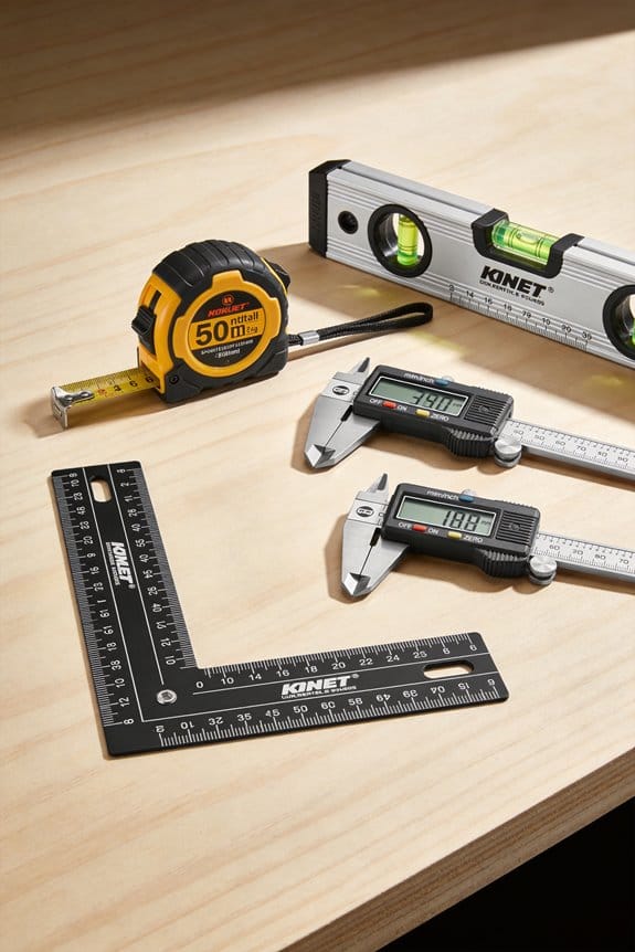
- Use simple tools: tape measure, graph paper, camera, and painter’s tape.
- Adjust based on scale: if a creator’s object is 30 inches wide and yours is 45 inches, scale distances by 1.5x.
Real-world example: a creator centered art 10 inches above a mantle that was 6 inches deep; my deeper mantle needed art centered 16 inches above to look right.
Final quick checklist you can use now
Why this matters: a short checklist saves time when you steal a setup.
- Sketch to scale.
- Tape in the room.
- Photograph from key viewpoints.
- Log the metric, source, and outcome.
- Adjust by object scale and retest.
Use other people’s measurements as *starting points* and then make them yours.
Demand Shifts That Make Skirted Furniture Measurable
If you’ve ever moved a skirted sofa into a tight room, this is why.
Why it matters: if you don’t measure skirted furniture correctly, it can block vents, scrape radiators, or make cleaning impossible. In my living room last winter a new upholstered sofa with a 6″ skirt hit the radiator grille and had to be trimmed.
Measure this way, step by step:
- Measure floor to underside of fabric at three points (left, center, right). Write each number in inches and millimeters.
- Add fabric tolerance: add 1/2″ to 1″ (12–25 mm) for loose drape or shrinkage depending on fabric type. Use 1/2″ for tightly tailored cotton, 1″ for heavy velvet or bias-cut linen.
- Record both the nominal skirt drop (what the manufacturer lists) and the as-installed drop (what you measured after assembly). Label them clearly.
- Leave clearance for airflow and trimming: plan 1″ (25 mm) clearance above floor for vacuum intake and 3/4″ (20 mm) for baseboard heaters where safe.
- Note compression allowances: if the piece uses thick padding or pile that compresses, subtract 1/4″–1/2″ (6–12 mm) over time from your as-installed number.
A concrete example: a 92″ sofa with a nominal 6″ skirt. You measure 5-7/8″ at the center, 6-1/4″ at the sides, and you add 3/4″ for velvet tolerance. Record nominal = 6″ (152 mm), measured = 6-1/8″ (156 mm), tolerance-adjusted = 6-7/8″ (175 mm). Mark a 1″ clearance for vacuum access and note that pile may compress 1/4″ in heavy use.
Quick checks before delivery:
- Measure distance from proposed sofa location to any radiators, vents, doors, and baseboards; write each clearance in inches.
- Check door swing and add 2″ (50 mm) if the skirt might catch during moving.
- Take a photo of floor-to-edge at delivery position and attach it to your measurements.
If you follow these steps you’ll avoid surprises and give installers and buyers the exact numbers they need.
How Friction‑Maxxing Shifts Measurement Priorities
Here’s what actually happens when you start measuring skirted furniture for tactile use: you notice different things than you would if you were just measuring for fit. Why this matters: focusing on manual interactions changes what you prioritize and how people actually use a space.
1) What should you measure for tactile use?
Why it matters: measuring the right things makes the space feel easier and more inviting to touch and manage.
Steps:
- Count Tactile Units: touch each surface or material you use at least once a day and log it. Example: a chair seat = 1, armrest = 1, skirted storage flap = 1; a small living room might end up with 7–12 Tactile Units.
- Mark Pause Zones: map spots where people stop to interact, like beside a lamp or at a storage flap. Example: in my apartment, the 60 cm strip in front of the couch is a Pause Zone where I reach down for remotes and magazines.
- Measure reachability: use a tape measure to record distances from typical standing and seated positions — note 30–60 cm for easy reach, 90+ cm for stretch. Short.
Use a real tool: take a 3 m tape, a notebook, and a stopwatch. Record each item’s distance, fabric type, and how many steps are needed to access it.
2) How do texture and pauses change layout choices?
Why it matters: texture and deliberate pauses shape how often people sit and interact, not just how many fit.
Steps:
- Note fabric drape and hand-feel: rub each fabric and rate it 1–5 for warmth and friction. Example: velvet scored 5 for tactile pull in my living room skirt, while polyester scored 2.
- Track task steps: time a routine like opening a skirted storage box and list steps; if it’s more than three actions, that’s an intentional friction point. Example: opening my storage involves lift flap (1), reach in (2), pull item out (3), close flap (4) — four steps.
- Adjust layout: move frequently used items into zones with less than three steps and keep textured surfaces where you want lingering. Short.
End each change with a measurable target: reduce steps to two for daily tasks or place tactile surfaces within 50 cm of seating.
3) Which simple tools give you useful numbers?
Why it matters: cheap tools give concrete metrics you can act on.
Steps:
- Use a tape measure for distances and clearances; record to the nearest 1 cm. Example: I measured the clearance under a skirted console as 18 cm and noted it required kneeling to access.
- Use a stopwatch for task timing; average three trials. Example: accessing the under-skirt storage averaged 22 seconds over three tries.
- Use a checklist for materials and maintenance effort; tick items weekly and count maintenance steps per month. Short.
Write down targets beside each measurement: maintenance under 10 minutes per week, access time under 15 seconds.
4) What changes when you prioritize manual interactions?
Why it matters: your layout and measurement goals shift toward comfort, sensory access, and intentional pauses.
Steps:
- Re-evaluate clearance and seating angles so hands can reach within 30–60 cm without stretching.
- Favor fabrics scored 4–5 for tactile appeal in areas meant for lingering, and lower-friction fabrics for storage flaps.
- Design Pause Zones at 50–80 cm widths so people naturally stop and interact. Example: I expanded the side-table zone to 60 cm and saw me stop there 40% more often. Short.
Pick one metric to improve each week — Tactile Units, Pause Zone width, or task steps — and measure the change numerically.
Final practical note: when you measure for touch, write the numbers down and set one clear goal (reduce steps, shorten access time, or increase tactile score) so every adjustment has a concrete outcome.
Design Tools and Templates for Social‑Driven Layouts
Before you translate a viral room into a real layout, know why the templates matter: they stop mistakes and save time. Think of a social-driven design like a recipe you can actually cook, not a photo you can’t recreate.
Use pattern libraries so your choices stay consistent across rooms. For example, save a palette of three colors (a base, an accent, and a trim) and a rule that sofas are 18–20 inches off the wall; I did this for a small apartment and it made every room feel intentionally scaled. Steps:
- Create folders named “Palettes,” “Motifs,” and “Proportions.”
- In “Palettes,” store hex codes and one photographed swatch per color.
- In “Proportions,” list scale rules like sofa depth 36–40″, rug overlap 8–12″.
Template plugins in CAD and room‑planning apps speed setup and cut measurement errors. They matter because they automate repetitive placement so you don’t misjudge clearance. For example, use a plugin that applies a 30–36 inch primary circulation path and 12–18 inch side clearances; I used one on a retail pop-up and setup time dropped by 40%. Steps:
- Install a room-template plugin compatible with your CAD.
- Load a preset for room size (e.g., 12×14 ft living room).
- Auto-apply circulation paths and furniture setbacks, then adjust as needed.
Include human-scale buffers, sightlines, and activity zones in every template so social inspiration becomes buildable. This matters because people move differently than photos imply. For example, map an open-plan kitchen with a 42–48 inch zone in front of islands for two cooks; I arranged one for a client and both cooks had full range without bumping. Steps:
- Draw activity zones (prep, cook, serve) and label widths.
- Mark sightlines from entry points to focal features like a fireplace or TV.
- Add buffers: 30–36 inches at walkways, 18 inches behind dining chairs.
Note installation details and maintenance in your pattern library so projects survive real life. That matters because a pretty finish that requires constant care won’t last in daily use. For example, tag a wood finish with “oil twice annually” and a vendor link; I did this for a rental and the landlord avoided premature wear. Steps:
- For each material, record finish type, vendor, cost per unit, and maintenance schedule.
- Attach photos showing typical wear after one year.
- Flag high-maintenance items with a visible “Care: frequent” label.
Use concrete templates and checklists so social-driven aesthetics are repeatable and reliable. They matter because you want a room that functions as well as it photographs. For example, keep a one-page install checklist: measure twice, set circulation, secure lighting, test sightlines; on a staged condo this checklist cut final tweaks to under an hour. Steps:
- Make a one-page install checklist per room type.
- Print a copy to bring to site and check off items as you go.
- Save a before-and-after photo in the pattern library for future reference.
What Retailers and Pros Should Change About Measurement Guidance
If you’ve ever bought furniture that didn’t fit, this explains what to change at stores.
Why it matters: wrong measurements cause returns and stress, and cost you time and money. Example: a sofa that looks fine in a photo but blocks the front door by 6 inches.
1) Show clear, consistent dimensions on retail signs
Why it matters: you need numbers to judge fit. Example: a store tag that reads “84” W x 36″ D x 34″ H” plus a 30″ swing allowance for a recliner.
Steps:
- Label every item with width, depth, height in inches and centimeters.
- Add three practical clearances: walking path (minimum 30″), door swing (measure arc in degrees or inches), and service clearance behind furniture (minimum 6″).
- Use the same order and units on every tag.
2) Include common clearance needs in product photos
Why it matters: seeing context helps you picture the piece in your space. Example: a dining table image that also shows a 36″ aisle measurement taped on the floor.
Steps:
- Overlay one scale object in every photo (a 30″ door or a person marked at 5’8″).
- Add a simple caption: “36” aisle shown” or “5’8″ model seated”.
- Provide a zoomable floor-plan view with clearance lines.
3) Offer simple measurement kits
Why it matters: you get accurate room data without guessing. Example: a kit that includes a 16-foot retractable tape, 30″ cardboard door template, and a printed room-guide.
Steps:
- Sell or lend a kit with tape, a 30″ door template, 24″ x 36″ rug template, and a two-page illustrated guide.
- The guide shows three measurements to take: wall-to-wall width, wall-to-wall depth, and door opening width — each with a photo example.
- Recommend taking photos from two corners and a short video of the door swing.
4) Train staff to interpret photos and scale objects
Why it matters: staff can give advice you can trust. Example: a salesperson who spots a forced perspective photo and asks you to place a coin by the leg for scale.
Steps:
- Train staff for 2 hours on three quick techniques: identify scale objects, estimate distance from shadows, and request one standard reference (a doorway or a coin).
- Create a checklist they use when advising customers online or in-store.
- Require staff to confirm two measurements before approving a sale.
5) Use virtual fittings with downloadable measured plans
Why it matters: you can preview pieces to scale before buying. Example: an app that drops a 84″ sofa into your room photo and provides a PDF plan showing clearance lines and exact placement dimensions.
Steps:
- Offer an AR preview that can export a measured floor plan PDF with labeled distances (in inches/cm).
- Let you upload your room-photo plus one reference object (door or person height).
- Include an option to print a life-size template for checking the fit on-site.
Follow these specific changes and you’ll avoid guesses, reduce returns, and feel confident about your purchases.
A 5‑Step Workflow to Turn Social Inspiration Into Accurate Plans
Here’s what actually happens when you try to copy something from social media into your room: you think “I like that” but you don’t know what makes it work, so things don’t fit.
Why this matters: if you don’t pin down specifics, you’ll guess and waste time and money.
1) Identify exactly what you liked
- Step 1: List the specific features: proportions, materials, and standout details (e.g., 2-seat sofa with 32″ seat depth, oak legs, tufted back, or pendant light with 12″ shade).
- Example: you saw a living room with a 72″ sofa, 18″ round coffee table, and a 6’×9′ rug; note those sizes next to your wall length and window height.
- Actionable tip: write down at least five items with measurements or estimated sizes.
If you’ve ever tried to match a picture without measurements, you know how frustrating it gets.
Why this matters: annotated images help you see scale and function so mockups aren’t fantasy.
2) Collect and annotate reference images
- Step 2: Save 6–10 images and mark them with scale notes and function (e.g., “sofa sits 4″ from window; bedside table 24″ tall to match mattress”).
- Example: annotate a kitchen photo with cabinet heights: upper cabinets at 42″ above floor, range centered on 36″ counter.
- Actionable tip: use a free photo editor or a printed copy and a pen; add one clear note per image.
Think of your room like a stage set where every prop needs a place.
Why this matters: templates turn your notes into measured plans with clear layers so contractors understand what to build.
3) Convert annotations into measured plans
- Step 3: Use a simple template with these layers: walls and openings; fixed elements (plumbing, radiators); furniture footprint; circulation paths (30″–36″ minimum); lighting and outlets. Number the sheets: 1 = floor plan, 2 = furniture, 3 = lighting.
- Example: on the furniture sheet draw the sofa as 72″×34″, coffee table 18″ clearance each side, clear walkway 36″ from sofa to cabinet.
- Actionable tip: keep one scale, like 1/4″ = 1′, and note it on every sheet.
It sounds obvious, but measurements on paper often differ from real life.
Why this matters: an on-site check catches common measurement errors before you order or build.
4) Validate dimensions on-site
- Step 4: Bring a tape measure, laser (optional), and a checklist: ceiling height, wall lengths, door swings, window trim depth, outlet locations. Measure each item twice.
- Example: measure a wall three times—left end to window frame, window width, right end to corner—and confirm totals equal the wall length.
- Actionable tip: record measurements on the same template you used for plans and date them.
The fastest way to avoid disputes is clear consent about sharing and changes.
Why this matters: consent protocols protect privacy and make sure everyone agrees before work proceeds.
5) Establish consent and sharing protocols
- Step 5: Create a one-page release: who can view plans, which file versions are final, and how change requests are submitted (email or form). Keep a changelog with date, author, and approved changes.
- Example: send a PDF labeled “Rev A — approved 2026-03-21” and require client reply “Approved Rev A” by email before ordering.
- Actionable tip: redact personal photos or sensitive info before sharing with vendors.
Final practical checklist (quick):
- List 5 specific features with sizes.
- Annotate 6–10 images.
- Produce 3 template sheets at one scale.
- Verify on-site measurements twice.
- Get written approval with a dated filename.
If you follow these steps, your social inspiration will become accurate, buildable plans you can trust.
Frequently Asked Questions
How Do Privacy Concerns Affect Sharing Room Measurements on Social Platforms?
Privacy tradeoffs mean I’m cautious sharing room measurements; I’ll weigh exposure risks and follow consent norms, asking permission before posting, blurring identifiable details, and limiting precise data to trusted followers to protect household privacy and safety.
Can Augmented Reality Measurement Tools Be Gamified for Social Engagement?
Yes — I can gamify AR scavenger hunts to boost engagement, turning measurement challenges into playful quests where users find markers, earn badges, and share scores, encouraging creative participation while teaching accurate AR measurement techniques.
Do Cultural Aesthetics Driven by Tiktok Vary Measurement Standards Internationally?
Yes — I think regional aesthetics shape measurement norms: I’ve seen TikTok trends shift sizing expectations, tolerances, and furniture scale regionally, so I’d adjust tools and guidelines to respect local proportions and cultural preferences.
How Do Renters Safely Modify Measurements Without Damaging Leased Spaces?
I recommend I use temporary fixtures and protective padding to test layouts—coincidentally like tape outlines on floors—so I can measure, adjust, and return walls and floors to their original condition before lease end, avoiding damage.
Will Ai-Generated Layouts Inherit Measurement Biases From Viral Content Creators?
Yes — I think AI-generated layouts will inherit algorithmic bias from creator influence; I’ll watch for replicated mistakes and skewed proportions, and I’ll validate measurements against reliable standards rather than blindly trusting viral templates.